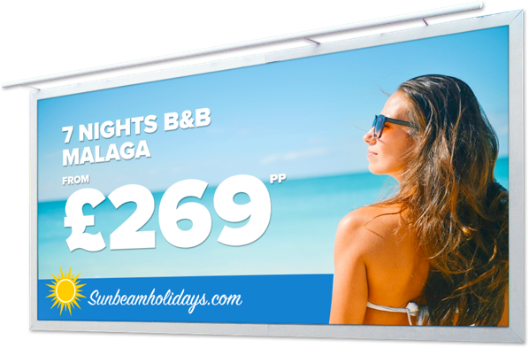
Six great tips for stand out signs
 Great signs are highly effective sales and marketing tools as well as being practical ways to advertise your brand in a variety of locations. Many businesses know this, so your clients’ signs will be competing with many others as well as with the surroundings. It’s estimated that most people will dedicate only between five and 20 seconds to signs, depending on their location and whether the viewer is on foot or on transport. That means your signs must to be able to get across their message quickly and with maximum impact.
There are a few tips to help your signage have maximum effect on all who see it, so here are our six of the best.
- Choose the right type of sign
Some signage is permanent and some might be required to travel. Vinyl PVC banners and posters are great options if your client wants to advertise at different premises, trade shows or events. See-through window graphics, adhesive backed posters, outdoor posters and backlit graphics are perfect if your signage is to stay in one place over a long period of time. Ask your client what they want from their sign before you suggest the best options.
- Keep it short and sweet
Remember that short viewing time? Ask your customer not just what they want to say, but what is the most important message they want their sign to promote. No one will read line after line of content but it’s not always easy to convince clients to cut text. Often they have a lot to say so advise them that their sign should be used to grow their brand, as call to action or to drive consumers elsewhere for more information rather than explain offers, products or services at length.
- Think about colours and contrast
The colours you use should not only stand out from each other but from the sign’s surroundings. For signs located in one location colour choice is easier. For banners or posters that will be used in a number of locations, pick a background colour that will sit out well wherever it’s placed.
- Make it personal
If your client wants to promote a product or service advise them to use language that talks directly to potential customers. Using words like “you” or “your” evokes a much stronger reaction from people than generic language.
- Use clear fonts
Yup, we’re back to the amount of time people will spend looking at any sign. If you want to get a message across quickly use clear, easily read fonts. Scripted fonts or fancy typography will be hard to read quickly, so most people won’t bother to try.
- Be different
Many businesses, especially in retail revert to huge red or black type on a yellow background to advertise sales or offers. Get clever with content, using jokes, design or imagery that jars with the surroundings and grabs the attention.
Banners, posters, window and backlit graphics – Take your pick
At TradeDigitalPrint.ie we supply trade customers throughout Ireland with a wide range of signage and large format print. It’s all printed on our high definition Roland large-format presses so your colours, graphics and images will really stand out. Register today on www.TradeDigitalPrint.ie to get 50% off your first order and free delivery along with exclusive trade prices, offers and benefits.


